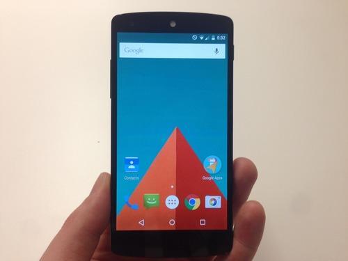
It’s got to be brutally hard to update your software every single year.
What do you add? How much do you change the looks? Where do you get your inspiration? How do you add enough new features to make your software more capable without bloating it up? How do you please everybody? What’s the difference between embracing the trending design and feature ideas — and blatantly copying your competitors?
Google and Apple each face this challenge every year. My guess? It gets harder every time.
Today, Google unveiled the latest version of Android, the world’s most popular phone operating system. It goes by the nickname “Lollipop,” because Google names its Android versions alphabetically after sweets (Gingerbread, Honeycomb, Ice Cream Sandwich, Jelly Bean, KitKat, Lollipop). Variations of Lollipop will eventually run on Android tablets, watches, TVs, and just about anything else with a screen.
The flat Lollipop worldThe biggest news is the visual overhaul. Like Microsoft’s Windows Phone and Apple’s iOS 7 before it, Google has adopted an extremely “flat” design: no texture or shadow. Solid rectangles of color. Sparse, simple, plain. It makes Android feel simpler and cleaner — and less heavy, since the black backgrounds of the home screens and the Settings app are now white or colorful.
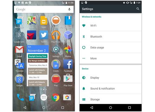
And check out the Back, Home, and App Switcher buttons at the bottom of the screen. They’re all geometrical now!

Unfortunately, there’s so little ornamentation that there are no cues left to tell you when something is tappable. What’s a button, what’s a label, what’s a heading? You won’t know till you try tapping.
On this Settings screen, for example, some lines of text are buttons (tappable). Some are just labels; nothing happens when you tap. One makes a pop-up menu appear. One opens another screen full of options. Can you tell by looking which is which?
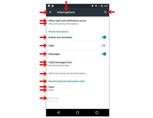
No, you can’t.
There’s another problem, too: In Lollipop, gray text no longer means “dimmed and unavailable,” as it has on computers for 30 years. In Lollipop, gray type may indicate a heading, or a button, or an unavailable option.
One of these symbols means that you’ve tapped the Shift key; the other means you haven’t. Pretty subtle, no?

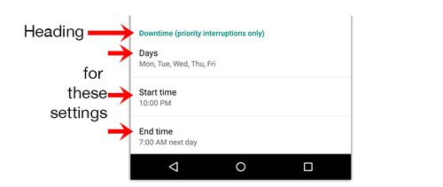
Eventually, you’ll figure it all out, but you may be in for a couple days of tapping and feeling silly.
The Control CenterIn Android of old, you could swipe down from the top of the screen to open a panel of quick settings buttons (brightness, Airplane mode, and so on). Now, though, that gesture opens your list of recent notifications: texts, calls, Facebook and Twitter updates. (That gesture works on the lock screen, too.)
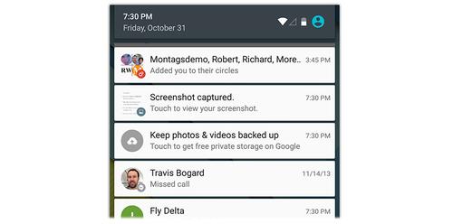
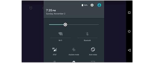
To get the panel of quick settings, you have to swipe down a secondtime. Two steps is harder than one, but at least there’s a shortcut for the quick settings: Swipe down with two fingers.
Android’s home screen still doesn’t rotate when you turn the phone. It seems a little odd, too, that when you’re holding your phone sideways, the quick settings panel is too big for the screen, requiring scrolling. Oops.
AccountsThe most original new feature in Lollipop is user accounts. As on Mac or Windows, you can now create separate accounts for various family members or school students, each with its own name, password, wallpaper, settings, Web bookmarks, and so on.
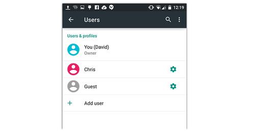
That feature will probably find more use on Android tablets than on phones, which people generally don’t share much. But even on your phone, you can, with three taps, turn on the Guest account, which protects all your private stuff from the eyes of anyone who says to you, “Hey, can I borrow your phone?”
App switcherGoogle has redesigned its app switcher — the list of all running apps that appears — to resemble the stacked-deck-of-cards effect of Safari on the iPhone. (Google now calls it the Overview.) You can paw vertically through this stack to find the app you want to reopen, or swipe one off to the side to close it.
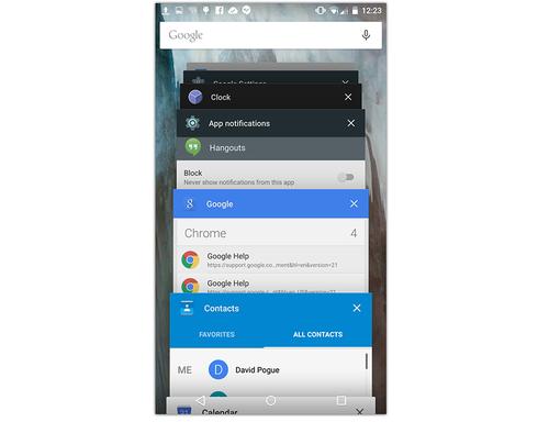
Some apps, like Mail, can generate a “card” for each open document. In other words, you can set aside an email reply you’re writing, look up some other message for reference, and then return to the one you were working on.
The Android appsThe app suite is still stellar; Android comes with Maps, Drive, Earth, Chrome, Keep, Sheets, Slides, Docs, and so on.
And the duplication of apps is still goofy. There are still two settings apps (called Settings and Google Settings) and two email apps (one for Gmail, one for other accounts). Goofy.
The feature listThe rest of the new features in Lollipop were largely stolen from — sorry, inspired by — other phones and phone operating systems. That’s how the game is played these days. Apple, Google, Samsung, and Microsoft routinely rip one another off — or, put more kindly, riff on each other’s ideas.
Here, for example, are some features that have been on Samsung, Motorola, or Apple phones, but are now part of the standard Android OS for all manufacturers:
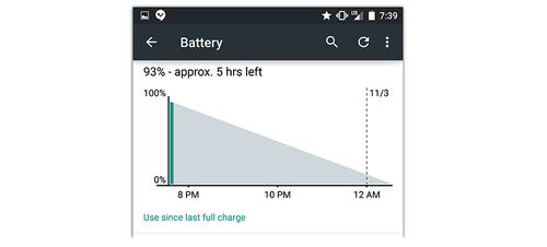
Battery Saver mode. In this mode, your phone or tablet slows down its processor, limits background activity (like mail downloading), and dims the screen. Google says you can eke out an extra 90 minutes per charge this way. (You can turn on this mode manually or when the battery reaches either 5 or 15 percent charge.)
When Battery Saver is engaged, bright red-orange screen borders remind you why your phone is suddenly so slow.
The new estimated-time-left display in Settings is cool, too:
OK Google. You can now trigger Android’s voice command feature without even touching the phone, just by saying “OK, Google.” Doesn’t work on all phones, alas; only those with “digital signal processing support,” Google says.
Do Not Disturb has finally come to Android. As on the iPhone, you can now specify certain hours during which you don’t want your phone to buzz, ring, or light up — when you’re in bed, for example. Also as on the iPhone, you designate certain very important people whose calls and texts are allowed to ring through, even during those hours; your spouse, kids, and boss come to mind.
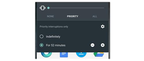
But Android’s version, called Priority mode (but labeled “Interruptions” in the Settings app), gives you even more specific control. You can differentiate the settings for Events and Reminders, Calls, and Messages.
You can summon the Priority on/off switch when you press either volume key on your phone — and you can specify that you want it to turn off again automatically after a specified period (say, after your movie or your meeting).
New ways to unlock. Face Unlocking, in which the phone or tablet unlocks when its camera recognizes your face, is now automatic when you wake the device.
It’s not especially secure, however; I was able to unlock the Lollipop phone just by holding up a picture of myself (on the screen of another phone).
You can also tell your phone to remain unlocked as long as a certain Bluetooth gadget — speaker, headphone, or watch — is within Bluetooth range. If that gadget ventures far enough away, the phone figures out that you’ve left the room — and locks itself automatically. Clever!
Quick transfer, phone to phone. A new feature called “Tap and Go” is designed to help you transfer your settings and apps from an old Android phone to your new Lollipop one.
Double-tap to wake. This option works only on Lollipop tablets, not phones. (Why not?) More useful is the option that wakes the device when you pick it up — and that one works on both phones and tablets.
Unwrapping the LollipopGoogle’s instinct to make Android feel lighter, airier, cleaner, and simpler is right on — and it has mostly succeeded. Mostly. (Let’s just hope that whoever was in charge of typography soon moves on to grayer pastures.)
If it all sounds good to you, your biggest challenge will be gettingLollipop. At the moment, you can get it in only one official way: By buying one of Google’s own Nexus phones or tablets. You can’t just download Lollipop and upgrade your existing Android phone with it.
Instead, you’ll have to wait until your phone maker, or even your cellular carrier, decides you can upgrade. So far, signs are good that these phones will be upgradeable, possibly in December or early next year:
- HTC: M7, M8
- Motorola: X, G, E, Droid Ultra, Droid Maxx, Droid Mini
- Samsung: S4, S5, Note 3, Note 4
- LG: G2, G3
And, of course, new phones and tablets introduced in December and thereafter will generally come with Android Lollipop preinstalled.
Once you finally have Lollipop in your clutches, you’ll be pleased with the enhancements, if momentarily baffled by some elements of the new design.
And you may well have to acknowledge that, little by little, year by year, smartphones are growing more and more alike.

No comments:
Post a Comment